Design af navn og logo til elbillader-app
SoftControl ApS / / 2021-22

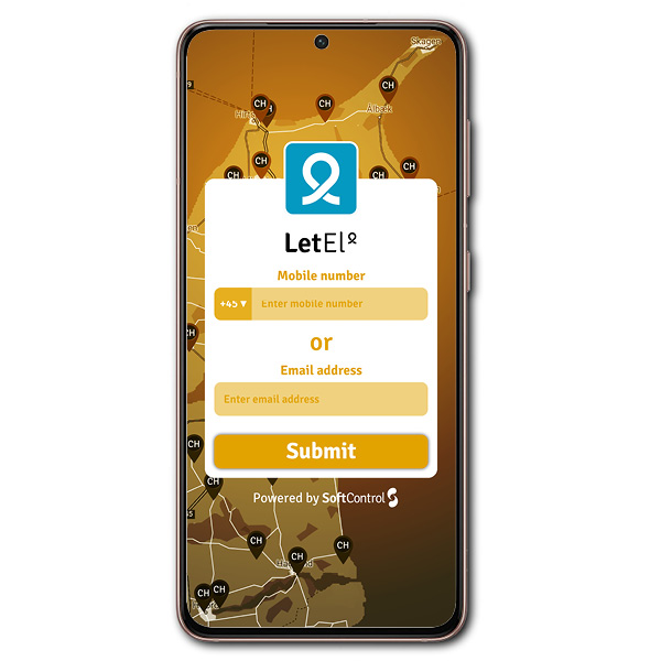
Design af logo og firmanavn til elbillader app.
Opgaven startede med at finde et velklingende firmanavn der beskriver produktets egenskaber. Produktet er en elbillader app der både hjælper folk med at finde ledige elbilladere og at stille private elbilladere til rådighed for udlejning. En begrænsning i opgaven var selvfølgeligt at navnet var nyt og at domænenavnet skulle være ledigt. Valget faldt på “letel” med den overordnede betydning at det er “let” at finde “el”. Ordet er et palindrom dvs. at det er ens når det staves forfra og bagfra. Let betyder også “udleje” på engelsk
I designet af logoet har jeg lagt vægt på at det har et enkelt og stærkt visuelt udtryk. Selve logoet/ikonet er symmetrisk på samme måde som selve navnet. Logoet har bl.a. følgende symbolikker indbygget:
- “sløjfen” i ikonet kan ses som et elkabel/ledning
- “sløjfen” i ikonet kan ses som en person (torso)
- hulrummet i “loop-et” kan ses som et map-pin-ikon med refernce til map-pin ikonerne i selve app’en
- “loop’et” forbinder a og b (forbrugeren) omkring et punkt (opladeren)
Design of company name and logo for electric car charger app
The task started with finding a good-sounding company name that describes the product’s properties. The product is an electric car charger app that both helps people to find available electric car chargers and to make private electric car chargers available for rental. A limitation in the task was of course that the name was new and that the domain name had to be available. The choice fell on “letel” with the overall meaning that it is “easy”(“let” means easy in danish) to find “el”(“el” means electricity in danish). The word is a palindrome ie. that it is the same when spelled from front to back. Let also means “rent” in English
In the design of the logo, I have emphasized that it has a simple and strong visual expression. The logo/icon itself is symmetrical in the same way as the name itself.
The logo has, among other things, the following symbols built in:
– the “loop” in the icon can be seen as an electric cable/wire
– the “loop” in the icon can be seen as a person (torso)
– the cavity in the “loop” can be seen as a map-pin icon with reference to the map-pin icons in the app itself
– the “loop” connects a and b (the consumers) around a point (the charger)